BRIAN ZAHM
I BRING MY Z-GAME
DEZIGN
My fascination with graphic design started in the early 80s when I designed screen printed T-shirts
MOVIE PROP POSTER
2014 | 27"x40" | Semi-Gloss Print
Design Note: This is my favorite poster I've ever designed. It's also the fastest I've ever worked, created in a hour to use as the main decoration for the set of the film MARQUEE. I wanted the poster to blaze red as a symbol of the danger the protagonist was in, pop against the green of the movie theater trim, exude a cartoony vibe, and most importantly, make fun of D-bag filmmakers (like myself) with their names all over everything. If you've made it this far, please read the credits featured on this poster — they do not disappoint.

MOVIE POSTER
2020 | 11"x17" | Photo Rag Print and Distressed
Design Note: This is the movie poster for PLEASANT VALLEY DRIVE IN. Worked on it for two full days. It was inspired by old drive-in movie newspaper ads and I filled it like a tattoo-sleeve. Lotsa fun Easter eggs and innuendo with this one. Originally thought about using a newsprint-like finish on newspaper white, but decided to print this on ragstock paper and distress it with fine sandpaper. I wanted these posters to look worn and beat up, so I stored them in my car's trunk for extra weathering. To be more fun and eye-catching, these came in three pastel colors, mint green, flamingo pink, and lemon sorbet yellow.

MOVIE POSTER
2022 | 11"x17" | Semi-Gloss Print
Design Note: This is the poster for the infamous (JUST) BALLOONS. This poster's a wee bit spicy (or is it just balloons?). It was inspired by old VHS covers. Imagined a 40-year-old VHS cover, so I gave it an aged and weathered feel. The cover image is from a BTS picture I took after we were finished making the film. The entire film was shot from one camera angle, so the debris collected on the floor in a single spot. Tasha Salad and I came up with nasty names for the cover — my favorite is "Bob Odorcock," which might just be the Chicago in me.

MOVIE POSTER
2024 | 11"x17" | Semi-Gloss Print
Design Note: This is the poster for DO NOT FEED THE PIGEONS. I hastily hung the sign on the fence (notice the zip tie) because we didn't have permission to film where we were shooting. Took this BTS image before we walked away from the pigeon-filled set. I distressed the metal sign at home by tossing it into a parking lot, smashing it with rocks, and throwing mud on it — signs in Chicago are sh*t shows. In post I added the background pigeons, graffiti (anarchy, satan, blood, Godzilla references), bird poo, blood splashes, and the blue ice melting chemical that seems to be on all street signs in winter. The final element I added was the pigeon sitting on the fence, lurking with dinosaur-y talons. Lastly, I love the frame within the frame and how the central image surrounded by the Xs created by the chainlink fence, representing death. Yay death!

2022 | 11"x17" | Gloss Print
Design Note: This is the poster for the ever-so-wacky A.i MOVIE. This is a disturbing one. Lots to look at: shapes reminiscent of images in the movie slathered with the grotesque. Made several AI-generated posters using text prompts and an image of the host of the film. Text prompts would be things like "female holding gun melting Eiffel Tower baguettes eggplant mime." I took the many versions and combined them. It's more than uncanny valley, it's just creepy, creepy like AI, which I kinda think is going to wipe out humans — it seems unavoidable — so stay tuned! In the film, I'm mocking vapid mainstream filmmaking as it's being replicated by emotionless, AI-generated, statistically-driven slop, hence the "Get showered in golden Oscar glory!" It's techy, it's creepy, it's sparkly, it's a bunch of strange/disparate elements, much like an AI abomination. The goofy credits were a must. It's printed on gloss stock to emulate techy design artifice.

MOVIE POSTER
2017 | 11"x17" | Semi-Gloss Print
Design Note: This is the movie poster for the ever-so-unsettling I, AN ACTOR. This film is bonkers, strange, mystifying, and dazzling — so this poster had to deliver the same. The film stars Ryan Czerwonko, who's featured on the poster. I made the poster from one of his old headshots. I used complimentary colors so the image pops, and then composited a lot of old school Wingdings to represent the various energies/emotions an actor might exhibit when portraying their character on their drive to be a star. I plunked my biz card on the forehead like a party game (my sad attempt at branding), but it kinda works. My favorite thing about this poster is the goatee credits — and yes, Ryan is "fearless."

MOVIE POSTER

MOVIE POSTER
2022 | 11"x17" | Semi-Gloss Print
Design Note: This is the movie poster for the A MOST DANGEROUS GAME. I didn't put a whole ton of work into this, just wanted it to look like a 30-year-old video game box cover that satirizes American values, as the film specifically comments on how 'Merica's love of guns makes monsters out of many. Much of this film uses both old skoo video game music and images to tell its story, so leaned into the 8-bit aesthetic. The color value overall is just gross, and dare I say, bleeds bloody, embracing the film's theme.
MOVIE POSTER
2005 | 11"x17" | Semi-Gloss Print
Design Note: This is the movie poster for the feature film HEADSPACE: THE SOUND OF LIFE. The poster needed to really stand out (RED! Contrast!) and feel hypnotic. This film is a graphic art representation of a record, with symbolic speaker coils and sound waves, as this film was about electronic music around the globe. This poster harkens back to my older screen print logo T-shirt designs from the 80s, where more basic patterns and minimal colors ruled the roost (after all, the more color, the more it cost to print). The overall vibe of this piece was a nod to the old school party flier that would be posted around town to hype parties.

MOVIE POSTER MOCK-UP
2012 | 11"x17" | Semi-Gloss Print
Design Note: This is a mock-up movie poster that was part of a pitch packet created for a feature film I wrote, "USA" — a horror satire of fame-starved capitalistic Americans who revel in shallow, exploitative ideas, i.e., the early influencer. This film is about a DJ who wants to take over the world with dubious and corrosive means. The poster features the label center of a record almost like a sun in the top left, with record grooves running throughout. Gotta have the gun because it's America (and is major part of the plot) — and we (not me) love our guns. The plot of the film is instigated by drug use (referenced in the movie poster's letters) and well, good old-fashioned madness ensues. The overall color palette is nod to the red, white, and blue from Old Glory and USA (an acronym I won't get into). I collaborated on a bunch of early music concepts with my bandmate, Jacoti Sommes. After we both saw "The Substance" (what a movie!!!!!), he said, "Yep, all I could think of is 'USA.'" I recently watched "Sinners," and all I could think of was "USA." We pitched it to some producers long ago and they passed. If there's anyone with means who wants to make the best low-budget horror film ever — like in the whole history — you know where to find me (I ain't getting any younger). Is this desperate?

MOVIE POSTER
2019 | 11"x17" | Matte Print
Design Note: This is the movie poster for the film REJECT, a short experimental text film about brutal and frequent rejection from film festivals. So I wanted this poster to be brutal and repetitive, very unfriendly in design. The word "REJECT" virtually loses meaning, the predominantly straight, inorganic lines close off the viewer, almost rejecting them. And the harsh blood red torments the viewer. The design is a callback to my earlier, more minimal graphic design for t-shirts and book jackets.

3D MOVIE POSTER
2024 | 11"x17" | Photo Rag Print
Design Note: This is the movie poster for PHOTOSYNTHESIS. This is designed to work with and without 3D glasses. With stereoscopic 3D Chromadepth glasses, the intricate flower pattern floats above the big brighter flower in the background, an effect brought to life through the use of lighter and darker blues, and the bright white title credits float above everything else. Even without the glasses, I enjoy how this design still creates depth, like a mashup of wallpaper and commercial nature art. 3D and nature — the cycle of life — is what this film is all about. I finished this with a white suede matte and white vinyl frame, which really pops. My main poster printer here in Chicago is C&L Printing, ask for Mike, and he even suggested, "We can make this into wallpaper for you..."

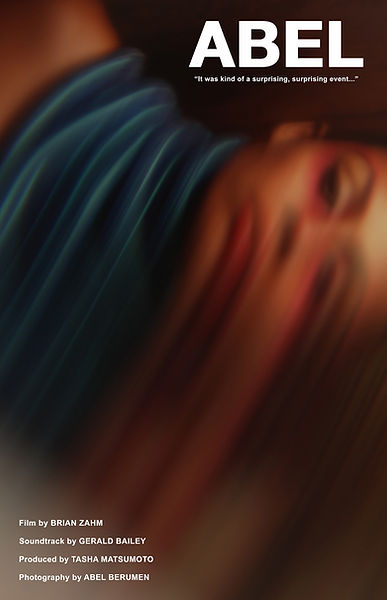
MOVIE POSTER
2025 | 11"x17" | Gloss Print
Design Note: This is the final movie poster for the short documentary ABEL about a professional photographer who wakes up blind one day as a result of a rare disease. The design started with a frame still from the film that features one of Abel Berumen's portraits filmed through a warped piece of glass I used as a filter. The film is built around the examination of Abel's photo archives, so ultimately I thought it best to create a poster design in line with the true vibe of what one might experience while watching the film. This particular image, I thought represented Abel's plight better in a way, because he is legally blind with no vision in one eye, and 5-10% vision in the other that creates a blurred, almost murky water type image of what he sees. So this poster is both an homage to his art, and his transformative experience. Went with a gloss print to bolster the image's opulence and sheen to match the tactile dynamic nature of interacting with the actual photo proofs.
MOVIE POSTER
2025 | 23.4"x33.1" | Gloss Print
Design Note: This is the second movie poster for the short documentary ABEL about a professional photographer who wakes up blind one day as a result of a rare disease. The design started with a frame still from the film that features a negative proof sheet from one of Abel Berumen's many fashion photo shoots and my gloved hand holding a magnifier. The film is built around the examination of Abel's photo archives, so ultimately I thought it best to create a poster design in line with the true vibe of the film. My original poster (see below), I love, but ultimately felt the packaging for the film was a wee bit misleading so I made a change. For starters, love the dramatic multi-image homage to the film form itself provided by the proof sheet. I love how the model's eyes are accentuated in the photo negatives, as this is a film about losing one's sight. Going along with that, I selected black latex gloves for the examiner's hand in the film to contrast against the brightness of the light box, essentially the darkness overtaking the light. Also, due to the model's eye line, I feel this poster looks back at the viewer, and that creates a connection and overall wonderment as we look at the bent, posed form of the figure who almost seems to be reacting to the "surprising event" referenced in the logline. I'm always a fan of clean design, and love this work's overall balance, the magnified image in the top right being buoyed by the big ABEL text in the bottom left. Went with a gloss print to bolster the image's opulence and sheen to match the tactile dynamic nature of interacting with the actual photo proofs.

MOVIE POSTER
2025 | 11"x17" | Photo Rag Print
Design Note: This is the original movie poster for my newest film, ABEL. The experimental documentary examines the life of photographer Abel Berumen, who is holding balloons in the poster. In the film, we learn he wakes up blind one day as a result of a rare disease, so I felt like this image captures "the surprising, surprising event" referenced in the longline. Abel Berumen shot this test photograph before his models arrived. In the background is Abel and in the foreground is an art director whom he frequently worked with. There is a photo-processing anomaly striping her eyes; I love this detail as the film is about the loss of sight. The American Gothic-esque composition of the image sums up his plight quite well. Notice the slight tilt to everything: this is intentional due to the challenging situation he found himself in. I went for a lot of texture with this image, love the scratches, the dirt, the frayed edges as the film's central concept is going through boxes of photo archives, bit by bit. Frankly though, I was afraid that
the heavily textured, dusty, decayed, askew image (that I love) would make potential festival screeners think the film, ABEL, was in fact a ragtag affair, so I worked on some redesigns as seen above.

MOVIE POSTER
2022 | 11"x17" | Semi-Gloss Print
Design Note: This is the poster for the documentary short CHOC. This film is about Aubrey "Choc" Muldrow who, because a crisis of faith and family ideology, must closet his true self. This whole film wanders through a liminal space, metaphorically filled with a nexus of nature and decay, as Aubrey discusses his experience. This poster is all about the flowers under the rot and the path the Choc has traveled. Notice him blending in under the main title? I used a medieval font like one might find in a Bible printing. The many diagonal lines (notice the old Baptist church sign?) depict an unbalanced world. Admittedly, this poster was really challenging as there's a lot going on. This film will always be really special to me; I love each of the people listed on the poster.

MOVIE POSTER
2022 | 11"x17" | Semi-Gloss Print
Design Note: This is the movie poster for the experimental doc MUGSHOT. This is the most personal film I've ever made, hence the hand-drawn title and credit. This film was created with Polaroid pictures and a copy machine — lotsa experimental animation — so wanted the poster to have a tactile feel. The picture, almost floating (thanks to the shadow) on the pulpy paper, is one of the central images from the film. This film is about troubling health news I received (it was a misdiagnosis — I'm fine) and how that forced me to come to terms with memories and lack of documentation thereof. Much of the film centered on how I've shied away from being in pictures and have instead stepped behind the camera. The color of the Polaroids was very important: the yellow represents cowardice I was facing up to. BTW, I'm holding my favorite camera in the whole wide world, the tried and true Bolex 16mm Camera with 3 lens Tourette! Ultimately I created a set of four different posters featuring different Polaroids from the film and put them on coffee mugs for my family for Xmas — the film's called "Mugshot," so of course the poster had to be put on mugs — duh.

MOVIE POSTER
2018 | 11"x17" | Semi-Gloss Print
Design Note: This is the movie poster for the short horror film LIPSTICK. The central image is a frame still from the erotic and terrifying film about a one-night stand between two women. I used a still from the film that was suggestive but not explicit that focused on the film's central plot device, and then flipped the frame 90 degrees to make it somewhat ambiguous. I combined some fonts and created the signature "S" of the piece to give them a sunken fang-like nature that relates to the vampire element of the story. Finally, for color, I used blue fonts in the credits to compliment the warmer skin tones featured in the image.

MOVIE POSTER
2015 | 11"x17" | Semi-Gloss Print
Design Note: This is the movie poster for the short satire docufiction film LE NU (aka "The Nude"). I know what you're thinking, "What kind of mauve-ridden hackneyed pretense is this?" Well, the film itself is a satire all about pretention, so the poster had to follow suit. It's about a self-obsessed model, played by the ever-amazing Ryan Czerwonko. I know what you're thinking, "Do all of your films feature Ryan Czerwonko?" Welp, three of them do — I love the guy. So Ryan's character, the nude, is reflecting upon his greatness as seagulls soar through the sky, a nod to French New Wave-inspired depictions of life all around us with a nod to vengeful gods in the heavens. The incline of the title that is being risen up and up and up by the credits relates to the film's protatgonist who is foisted by his own petard. Things had to get erect since this guy's in love with himself. I adapted the logline from a Salvador Dali quote and made this film under the name of Brier Zahm (like the cheese!), not Brian Zahm, because the film was entirely in French and I wanted to lean into the pretension. As for the mauve, it's kinda gross like pretense so I went with it. This poster is absurd, over-the-top, and yeah, there it is.

MOVIE POSTER
2017 | 11"x17" | Never Printed
Design Note: This is the movie poster for the unreleased docufiction feature film WRATH OF THE FILM GODS. The poster features Adam Meredith, an actor I hired to infiltrate a real movie set posing as a bumbling European stereotype who doesn't speak English and definitely doesn't understand the concept of a movie set. After creating the character, developing his accent, posture, and affectations, we went to a whiskey bar to get some courage. The poster's photo was taken outside said bar just as the sun was beginning to set. I like this poster a lot, but upon posting it on the website, I see some things where I'm like, "I could tweak that." Maybe some day, I release this film, maybe I don't... if I do, I'll definitely tweak the poster. Before then, hire Adam!

WHAT YOU PREACH
2006 | 24"x31" | Photo Rag Print
Design Note: I made this for a God-fearing friend and forgot about it until I was building this site and looking through archives. It's fun. It's Jesus-y. It's the "practice what your preach" sort of deal. I like the beard-born illusion. I finished it with a 3" white suede matte and 1" white vinyl frame to make it holier-than-thou.

GREETING CARD
1997 | 5"x7" | Matte Card Stock Left Side Fold
Design Note: Made greeting cards (blank inside) for my family and friends one year, featuring the family dog who was a cutie-wootie. Always love making stuff for my mom.

COASTER
1997 | 4.25"x4.25" | Glossy Ceramic Coaster
Design Note: To compliment the card I made of our family dog (pictured above), I also made a set of four coasters to round out my family Xmas gifts. We loved that dog. RIP Rani Dae (we adopted her on a rainy day).

BIZ CARD
2012 | 2"x3.5" | 2-sided Card Stock
Design Note: I made this business card after launching my website to promote it, to share my contact info, and look professional, dammit! Anywho, the two-sided design was primarily made because most people mispronounce my name. ZAHM rhymes with CALM and BOMB. And I thought the bomb on the back was a sassy little splash as a counterpoint to the derivative front.


BOOK JACKET
2002 | 13.3"x9.4" | Gloss Print
Design Note: I designed this for the book RED ROOM by Alien Stevens, their second collection of 40 short stories. I created the font for the front cover and the alienesque circle design on the back. These crop circles are also a nod to the book's protagonist, who lives in a circular red room for 40 days and 40 nights. It was a big fight with the publisher to allow the ISBN to be oriented that way. My favorite aspect to this design is how the R in the title looks both like an alien's face and a UFO.

BOOK JACKET
2001 | 13.3"x9.4" | Gloss Print
Design Note: I designed this for the book THE BRINK by Alien Stevens, their first collection of 50 short stories. This book is about the nexus of good and really, really bad — living on the edge — embodied by the high contrast, split-level design. The quotes are an homage to the literary arts and the red font color hints at the danger lurking in these stories.

STICKER
2001 | 2"x3" | Vinyl Gloss Sticker
Design Note: Did a lot of work for AlienStevens.com and one of the promotion tactics they used was putting up stickers anywhere and everywhere. They printed 2,000 of these, most of which were put up all over NYC, New Orleans, Portland, and the Midwest. This drove traffic to their site and helped sales, so really have to respect this guerrilla marketing effort. I don't know if this promotion had anything to do with it, but the books became weirdly popular in Paris and Moscow.

BRAND LOGO
2001 | Varied Size | Varied Use Branding Logo
Design Note: Did a lot of work for AlienStevens.com, including a branding logo designed as a spray-painted graffiti tag based on Alien Stevens's autograph. Their signature embraces anarchy and the dollar sign, all rolled into one — pretty sure these two things aren't mutually exclusive.

T-SHIRT
2001 | 4-color Silk Screen
Design Note: This attention-grabbing design screen printed on the back of a white T-shirt makes me happy. It confronts people. The one-and-only Mac Rock printed 25 of these shirts, and I hand-painted all of the tarsiers' eyes with glow-in-the-dark paint so they’d pop out at night. Oh, those were the days!

PARODY BRAND
2002 | Parody Brand
Design Note: Did a lot of design for AlienStevens.com to promote their short story collections, some of which I later adapted into films. Anywho, the stories were mostly trashy fast-food fiction (i.e. really short stories) with high shock value. So I was given free rein to embrace that aesthetic. This design was printed on all sorts of apparel, including my favorite, the gray American Trash hoodie where the logo's dissonant aesthetic dancing between tech and trash seemed to shine. This was a parody of the sorts of brands that were popping up around that time. Kinda feel like American Trash was ahead of its time because American Trash isn't just a brand, it's a lifestyle. Fun fact, my friend and I were going to the horse track one sunny afternoon and his wife called us "American Trash" so I went with it. She wasn't wrong. And quite honestly, this might be my favorite thing I've ever created in any art form, so yeah.

T-SHIRT
2007 | Single-Color Silk Screen
Design Note: I ostensibly made this to promote the album ATARI PARTI by Dull Boy, but mostly just to have a cool T-shirt. My friend, a silk screen artist, printed a limited batch of 15. I wanted to save time/money on the printing so opted for a single color. I've designed so many T-shirts and products in my time, but this is the only image of a mock-up that I have.

CLOCK
2015 | 12"x12" | Matte Print Circular Clock
Design Note: Here's a design for a "Crack Rocks" clock, because why not? Found this when I was looking through old stuff, laughed, and decided to put in on here. Sometimes I designed my own fonts and kinda like this cattywampus vibe. You can see the actual clock hanging in my office behind my warehouse studio desk (look at the end of PICZ).

LOGO
2005 | Varied Size / Use | Logo
Design Note: I used this logo to promote the DULL BOY brand. I scanned a butcher knife to create this. It's a cheeky design. Dull Boy isn’t so dull now, is he? Nope, he’s a doll boy made out of knives — get it?

CLASS PROMO AD
2015 | 8"x8" | Copy Paper Print
Design Note: I designed this flyer to promote my Experimental Filmmaking I class at DePaul University School of the Cinematic Arts. When I arrived at DePaul, I quickly found it was very Hollywood-driven, and I wanted to create a ballast for the diversity of voices in the school, not to mention teach experimental film, my favorite art form and IMHO a catalyst to create visionary products in all areas of art. This video art-inspired design was meant to be posted as an endlessly scrolling replicant of vertical diptychs and triptychs.

LOGO DEMO
2005 | Varied Size / Use | Logo
Design Note: Back in the day, someone asked me, "You okay?" and I just went with it. I love the notion of care. I knew I needed to make the logo, regardless of what I'd do with it. This was a design I mocked up, just to say U OK. I've struggled with things in the past, the ups and downs in life, and thought putting positive affirmations out there was a good thing. Feel this is a predecessor to the "YOU ARE BEAUTIFUL" message all over Chicago, but not nearly as well stated/presented. You know, sometimes you swing and miss...but that's okay.

GREETING CARD
2003 | Matte Print Greeting Card with Top Fold
Design Note: I happened upon this when looking through some archives. I made this generic greeting card for people to send to whomever, whenever. I love to make stuff for people I love, including this set of four greeting cards. I staged some robot toys in front of a weird NYC cityscape I found at a thrift store, added some noise, and voila, here it is. Kinda cute... am I getting soft?

VIRTUAL STAGE SET
2008 | 4 Projector Stage Set
Design Note: I created this virtual projection set of a futuristic airport for a play called DISCOCCIA. They needed it to work with four projectors. The primary set is a concourse, and on the sides of the audience, we projected gates where I green screened in some silhouettes pulling luggage on a two-minute infinite loop. The set layout was designed in Photoshop, then I combined everything in After Effects. When finding these pix, I realized the lead in this play was the wondrous Lisa Marie Summerscales, who later acted in my films WIGGAH and THE LAST DANCE before she became a Hollywood big shot:~)


